Role
Design and build an interactive data visualization and application tracking system(ATS).
Tech Stack
React, Redux, React Query, Nodejs, Mongodb
Tools
Figma, Github, Postman, Aws
Duration
1 Year 04 Months
Year
2022
Intro.
Youth Ministry ATS stands as an innovative data visualization and application tracking system, crafted with precision using Figma, and driven by the latest tech stack that comprises React and TailwindCSS for the frontend, and Node.js, Express, and MongoDB for the backend. This formidable technological combination forms the backbone of a high-performing and user-centric solution.
User Acquisition.
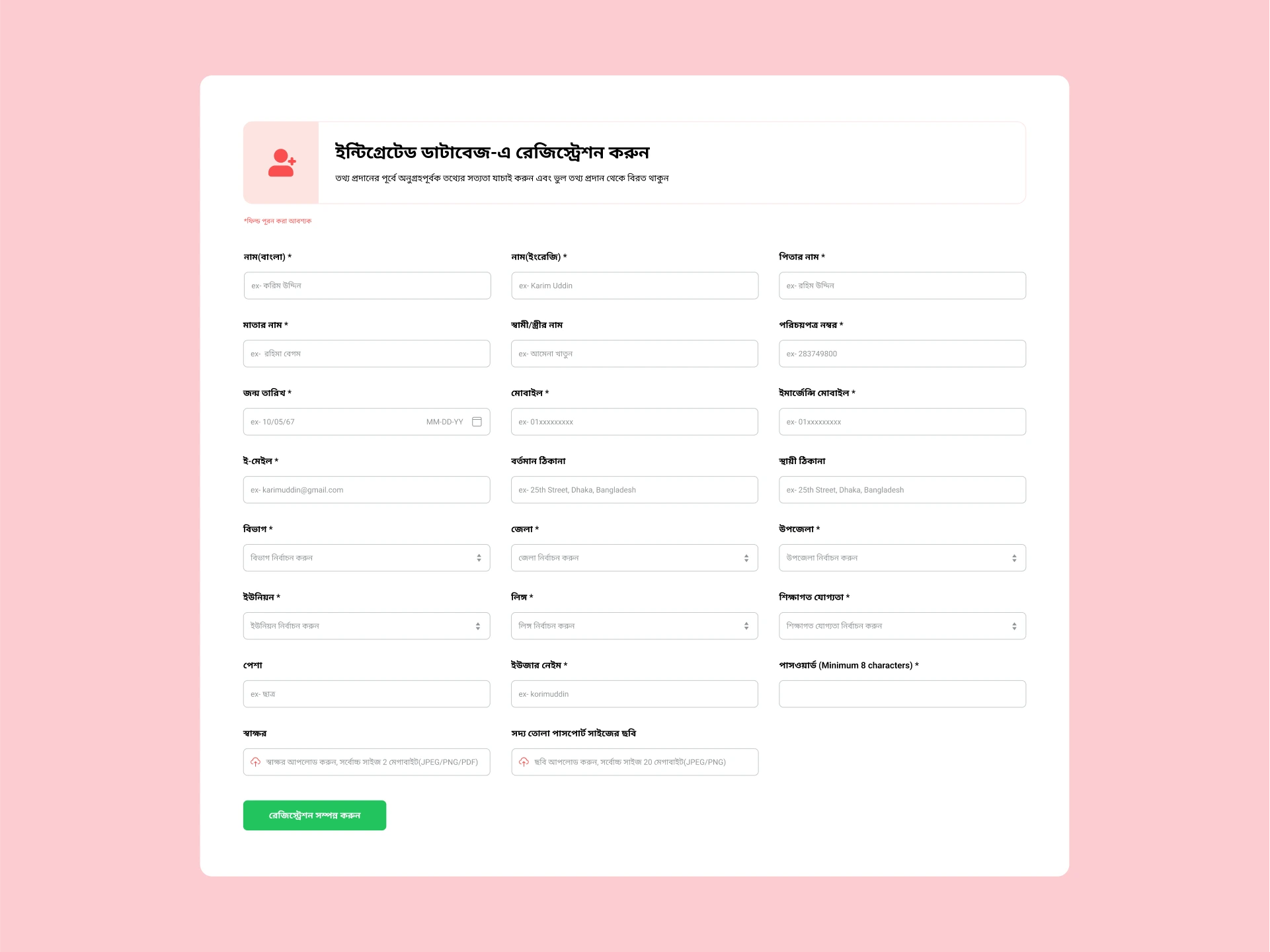
In designing and implementing the registration form for user acquisition, I've taken several steps to enhance the user experience. To minimize visual weariness, I've organized the form into a 3x3 grid, breaking down the registration process into manageable steps. I've utilized Formik for handling form states and Yup for data validation, ensuring that user inputs are accurate and error messages are clear. The UI components have been carefully crafted for consistency and reusability using Tailwind CSS and Formik's hooks. Additionally, I've provided users with the option to upload required files, making it convenient for them.
Applicants Profile Review.
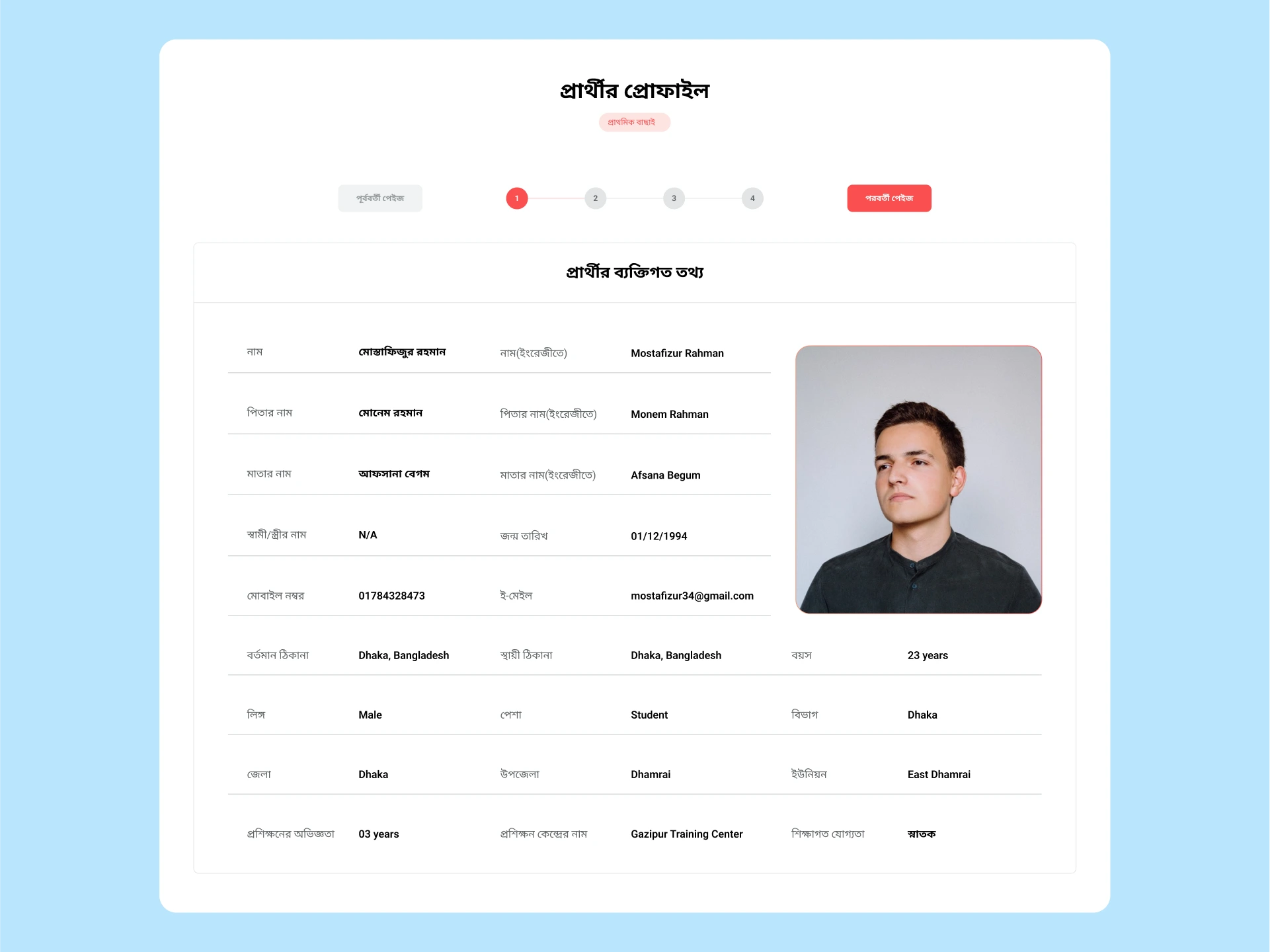
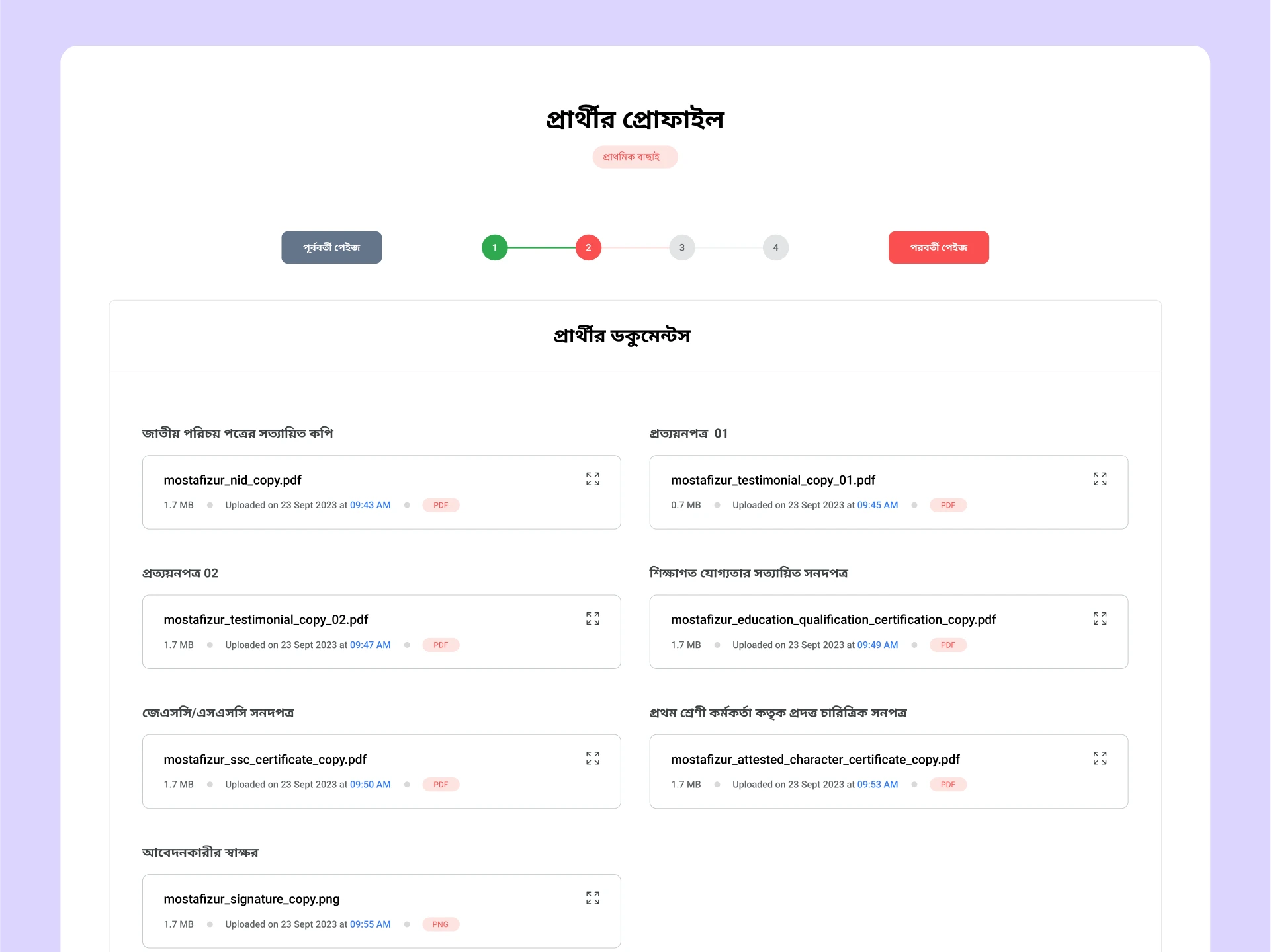
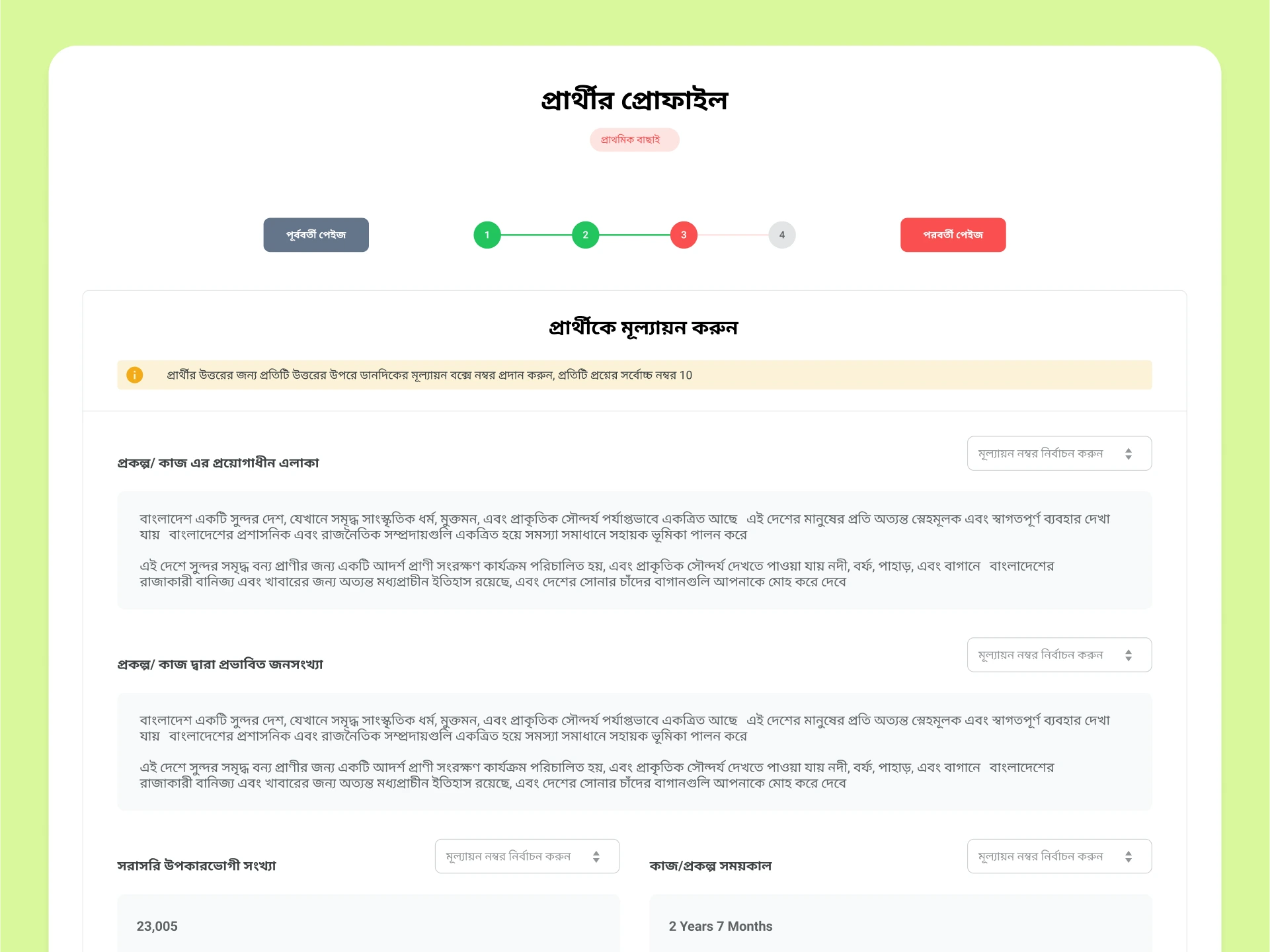
In the ATS, I've implemented a highly efficient multilevel approval system. I've broken down the applicant's information into multiple structured steps, and I've created a user-friendly custom-built stepper interface to guide application reviewers through these steps.
Application Approval.
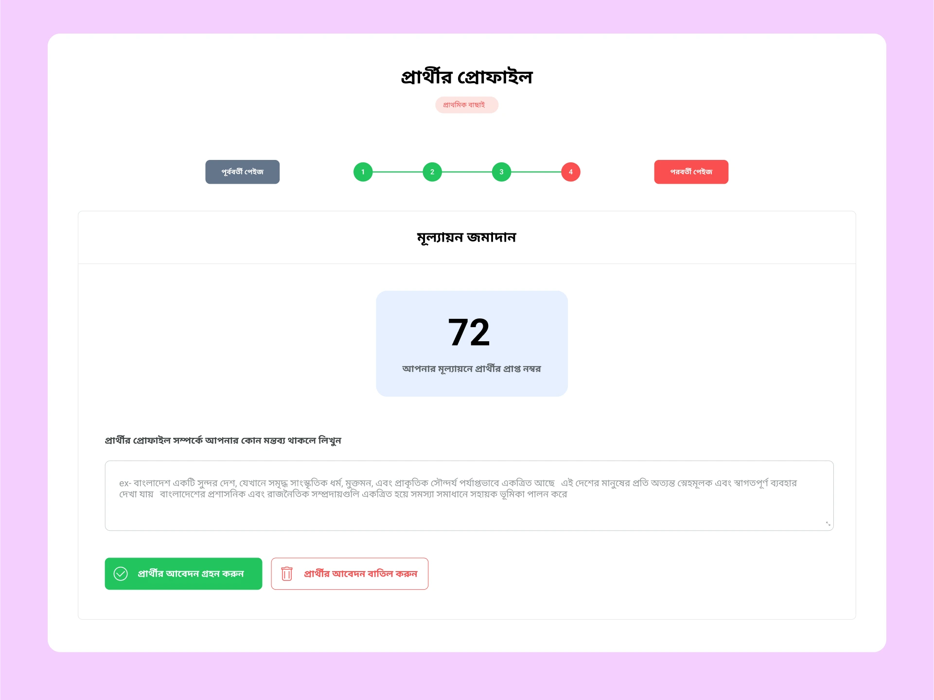
After evaluation, the reviewer can see the evaluation score and the reviewer can either accept the applicant, allowing them to proceed to the next level of the evaluation process, or reject the applicant if they don't meet the specified criteria.
It's All About Data.
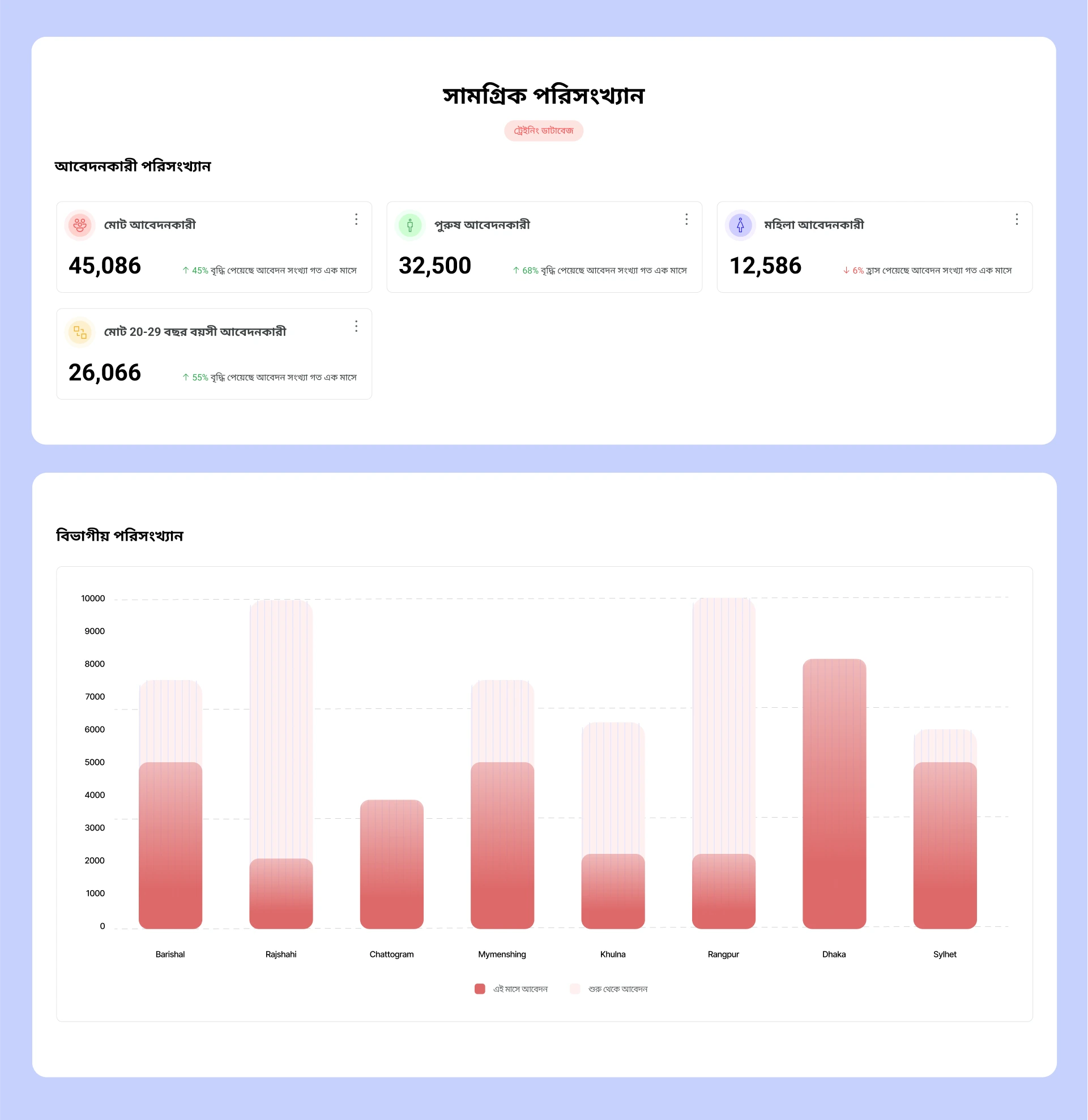
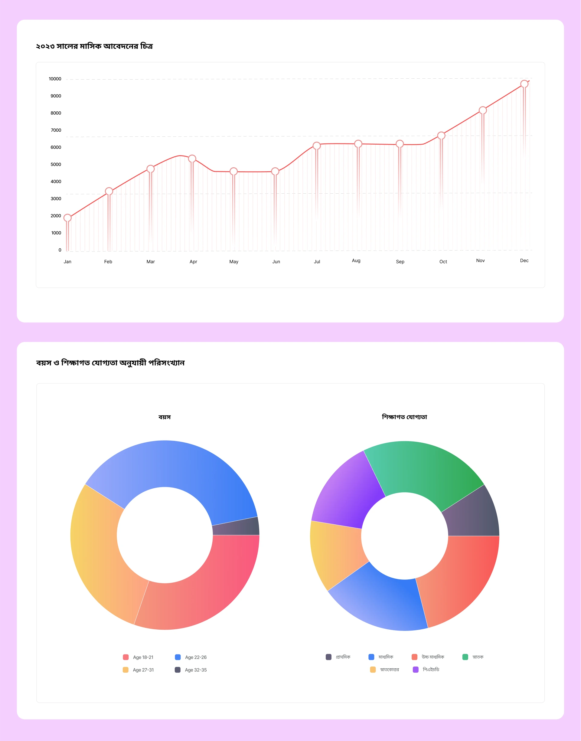
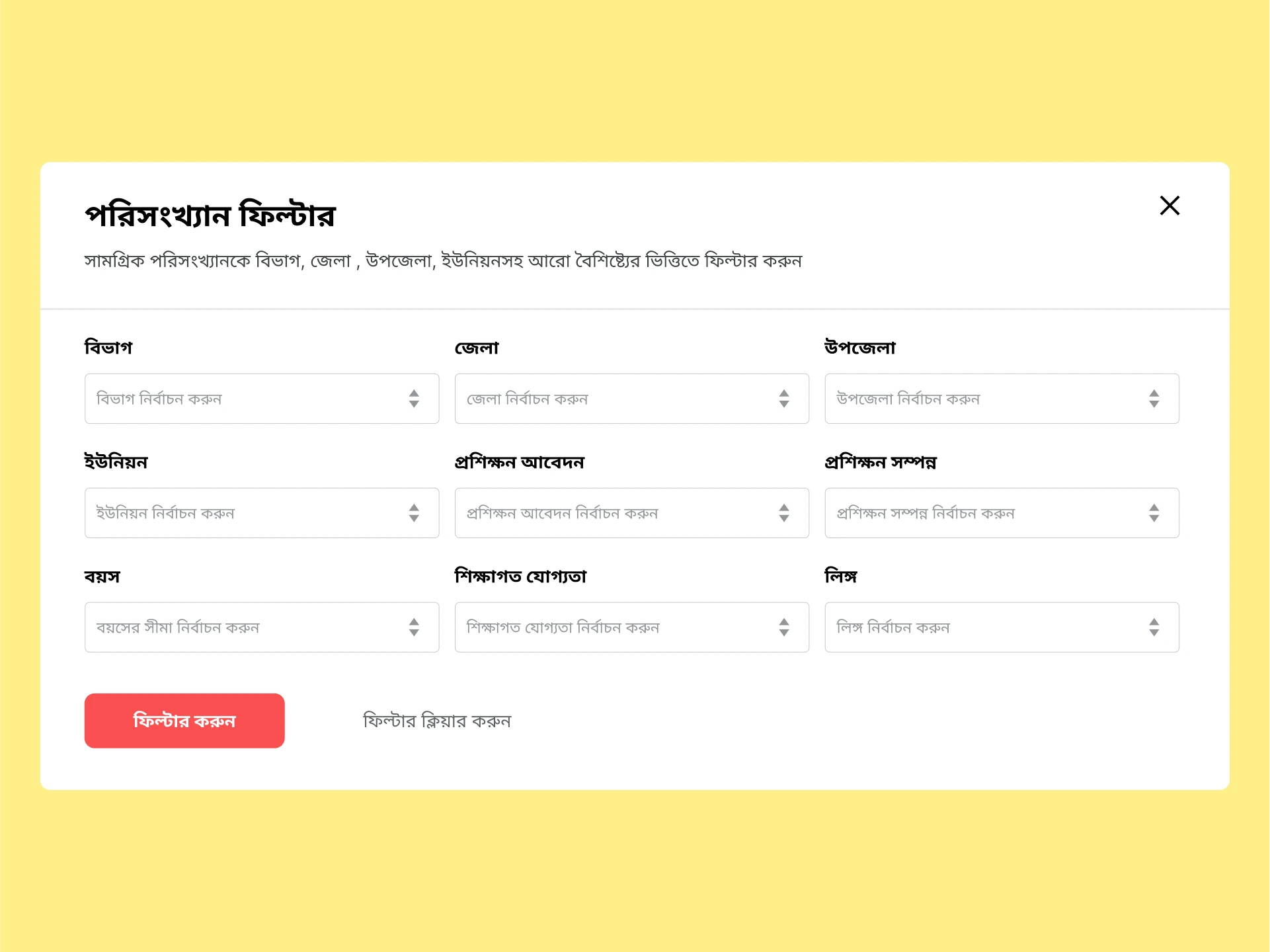
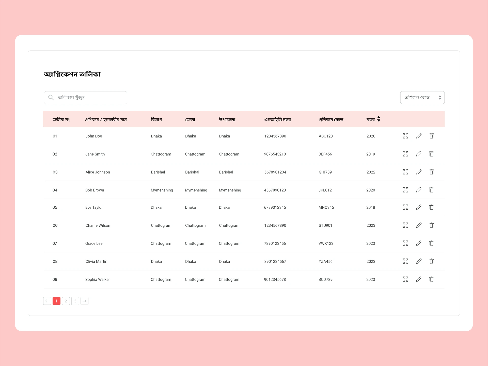
Visualizing a multitude of applications was paramount for gaining a holistic perspective on the system's performance. To achieve this, I leveraged the powerful Nivio Charts library for creating interactive, data-driven statistics and visualizations. By employing various chart types such as bar charts, pie charts, and tables, I aimed to furnish the management team with comprehensive data-driven insights. These visualizations not only offered a clear overview of the system but also facilitated data distribution, equipping the decision-makers with the tools they needed to make informed and strategic business decisions.
Like What you see?.
Checkout My Other Interesting works.
